Main Menus
Overview
Tabbed main menu screens that are accessible by clicking the folder tabs serve as starting points for different types of users. They consolidate links to common functionality for each and serve as portals to those functions. Most display boxed-in menu groups containing links to either e-docs or lookup screens. The following sections summarize the purpose of each tabbed menu and the link group boxes they contain. Appearing at the top of most KC screens, these global application constants are software screens that serve as menus which allow you to locate and start using the desired functionality to accomplish your tasks. This topic explains how to use the features that allow you to interact with the software to get started with your tasks, and it also explains the orientation to familiarize you with how to find what you’re looking for quickly. Cross-references and links are provided throughout, so that the documentation also serves as a starting point from which to quickly “drill down” to topics providing additional detail on the feature you want to use.
Menus, Groups, Links and Icons
User interface elements that appear as folder tabs at the top, left of any KC screen are intended to serve as global menu navigation features. Each displays a menu containing labeled groups, some of which have bolded subsection headings. These allow you to efficiently browse for and navigate to the functions and features you want to use, which generally appear in the form of bullet lists of hyperlinked options you can click on to access.
Menus
The five main tabbed menu screens are organized by generic system usage roles. They are located in the header area at the top, left to the right of the Kuali Coeus logo, and in general are constantly available regardless of where you are in the system. Clicking a folder tab causes that tab to become highlighted with a darker background, and at the same time causes that menu’s content to be displayed in the forefront of the body area of the webpage. The primary content of each menu is Groups, which are boxed-in links that typically allow you to navigate to lookup screens and e-docs.

Figure 81 The 5 KC Menus
Groups
The boxed-in link groups on each menu screen are organized by grouping similar or related functions together in each. Clicking an underlined text link causes the desired functionality to appear – whether that be a search (lookup) screen, e-doc, maintenance e-doc, workflow e-doc, or configuration screen. In addition to bullet lists of links, the Unit and Central Admin menus display groups containing icon buttons for “create new” and “lookup”. Some groups further categorize related links within the group by way of bold, black subheadings (for example, in the Protocols group on the Researcher menu, two subcategories exist named ‘Actions’ and ‘Lists’.
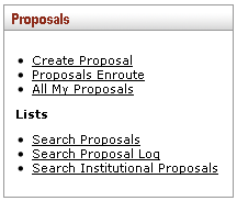
Figure 82 Group Example
|
|
Different Naming/Layout: The menu screens and/or link groups may differ than what is depicted in this documentation due to the fact that this covers the “vanilla, out-of-box” product, and your institution’s implementation may have included the reorganization or renaming of these user interface elements based on its unique requirements and customization of the software. |

Links
The bullet lists of underlined text links typically function as standard hyperlinks to e-docs or lookup screens. When you hover your mouse over one, your mouse pointer icon changes from an arrow to a hand, the black text turns red, and popup text appears. Bullet list items with text that is not underlined indicates the functionality is temporarily disabled or serves as a placeholder for future activation.
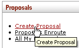
Figure 83 Link Example
When clicked, the desired functionality is accessed. In this example, a new proposal is created, and that e-doc immediately appears as a blank form with a new, unique document number displayed in the Doc Nbr header field.
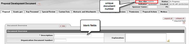
Figure 84 New, Blank E-Doc w/ Unique Doc # Displays After Clicking "Create" Link
|
|
Link/Document Naming: Typically the links are named in such a way as to make it clear what the expected result is, however, some naming inconsistencies exist. In this example, from clicking a link named ‘Create Proposal’, you would expect a document to appear called ‘Proposal’, however, the label for the new proposal document that is displayed is actually ‘Proposal Development Document’. |

Icons
The Unit and Central Admin menus display Create New and Lookup icons in place of bullets within the groups.
 The round Add or Create New icon that
displays a white plus symbol with a green background functions as a standard
button that, when clicked, initiates a new, blank document of that type with a
status of Initiated and a unique document number.
The round Add or Create New icon that
displays a white plus symbol with a green background functions as a standard
button that, when clicked, initiates a new, blank document of that type with a
status of Initiated and a unique document number.
 The round
Search or Lookup icon that displays a magnifying glass symbol with white
background also functions as a standard button that, when clicked, displays a
lookup screen for that document type with controls for refining the criteria and
then execute the search.
The round
Search or Lookup icon that displays a magnifying glass symbol with white
background also functions as a standard button that, when clicked, displays a
lookup screen for that document type with controls for refining the criteria and
then execute the search.
|
|
“Greyed-Out” Concept: These icon buttons may appear as “greyed-out” which indicates they are either placeholders for future functionality, or are temporarily disabled. Typically, if an implementing institution decides not to use a particular function, they remove it entirely from the user interface. |
 Researcher